Geraldine Madariaga and Dr. C. Shane Reese, Statistics
Introduction
Industries use control charts to evaluate whether or not a process is “in control” or producing parts that meet the standards of quality. Control charts are based on the principle that variation between samples can be predicted based on sampling distributions. Parts are measured and the computed test statistic is plotted within limits that are based on the standard deviation or quantiles of the sampling distribution of the test statistic.
The most common control chart is based on the sampling distribution of the average of a sample. These control charts are used under specific assumptions: the data must be from a normal distribution and the true mean and variance must be constant. Other types of control charts exist. S charts, based on the sample standard deviation, and R charts, based on the range, are sometimes used in industry. However, an S chart also operates under the assumption of constant variance and an R chart is very inefficient.
There are situations that make the previously mentioned control charts unusable or undesirable for evaluating processes. The situation that prompted this study occurred at Los Alamos National Laboratory (LANL) in New Mexico. At LANL, scientists need to measure iron quantities in samples but have found that the variance increases as the value of the sample mean increases. This nonconstant variance means that standard control charts cannot be used since the assumptions are violated.
Model Development
A model for this type of data is where γ = σ/µ is a constant. Notice that the standard deviation is proportional to the mean. This means that as the mean increases the standard deviation increases by γ. Using either MLE or MME techniques γ can be estimated with . This test statistic is commonly calculated and is often called the coefficient of variation or the relative standard deviation (RSD).
![]()
research focused on examining this possibility through a simulation study and statistical evaluation. Our goal was to develop a statistically accurate control chart for G.
Simulation Study
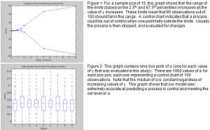
MATLAB® is a software package that offers a statistical toolbox addition which contains random number generators. Using MATLAB®, the first step of the simulation study was to find limits of the proposed distribution of G for values of γ and sample sizes that were of interest. We chose nine values of γ (0.05, 0.25, 0.5, 0.75, 1.0, 1.5, 2.0, 5.0, and 10.0) and six sample sizes (5, 10, 15, 20, 25, 50). To improve accuracy, 100,000 points were generated for each combination of γ and n (sample size). These points were then sorted and the 2.5th and 97.5th percentiles were found, so that the expected number of points out of control for each control chart would be 5 percent (α = 0.05). (See Figure 1.)
The next section of the simulation study focused on generating samples from the distribution of interest. The data for five thousand control charts, each with 100 observations, were generated and compared with the limits that were previously computed. The number of observations out of control was found and the average of these was plotted against changes in n and γ. These preliminary graphs had unexpected results, so α was calculated from 1000 control charts for each situation and this data is shown in box plots. (See Figure 2.)
Results and Conclusions
I was surprised by the results of the simulation study. I was expecting a noticeable trend as the sample size and value of γ increased. This would show what ranges would be most useful for the control chart and allow recommendations for use of our proposed model. However, the proposed model was extremely accurate at predicting when a process was in control for the given α regardless of sample size and value of γ. We conclude that the model is accurate for all cases we evaluated and will prove to be valuable as the basis for a control chart.

