Melissa Manwill and Professor Robert Barrett, Department of Visual Arts
This project began as a desire to try my hand at making a graphic novel. I’d never done it before. Neither had my classmates. We had also never made a collaborative art project in the way that the animation program makes a film each year. Those two desires culminated in a 12-person team compiling an anthology of graphic novels to address illiteracy by helping students ages 9-14 get excited and stay excited about reading. The concept is like the children’s TV show Wishbone. You target the reluctant readers who are 9-14 years old, and you give them a teaser of classic stories that are required reading in junior highs and high schools. Hopefully, you get them interested enough that they actually pick up the book and read it for themselves. Graphic novels are good tools for this because they’re a natural bridge between picture books and novels.
Each person in our team chose a story that they personally enjoyed and desired to share with the younger generation. I had originally planned on illustrating Watership Down by Richard Adams, but I ran into the slight snag of his book not being part of the public domain. Since I didn’t want to tread on any legal toes (especially since we want to actually publish a book), I switched my focus to Edmund Rostand’s play: Cyrano de Bergerac. Early on as a team, we decided that each person should illustrate 12-16 pages. That’s not a lot of room to tell a story with, so I chose to focus only on the first act of Cyrano. It introduces all the necessary characters, exposes the reader to Cyrano’s clever, amusing, and obnoxious wit, and even has a bit of sword fighting. Not to mention it has a cliffhanger ending that I could use as a hook to get kids to want to read the rest of the story.
Developing the look of a story turned out to be more work than I thought it would be. During winter semester of 2012, I signed up for a comics book class taught by one of my old teachers, Jake Parker. It opened my eyes to many new concepts, like the ideal size and amount of text in ratio to imagery, how to pace action, how to set up an establishing shot, and the use of dynamic “camera” angles. Another thing he taught us that I’d never thought about before is “thumbnailing” out the speech bubbles before the subject matter. Thumbnailing for an artist is the first stage of development, where you figure out the basic shapes and composition of a piece at a small, abstract scale. Jake taught us to plan all the visuals around the speech bubbles, placing them in a pattern so as to lead your eye through an entire page in a logical way, and giving the text and images room to breathe. A graphic novel that has too much text feels cramped and crowded. Because of this, I had a difficult time paring down the original script of Cyrano into a manageable size for 16 pages.
All during winter semester, I kept drawing concept sketch after concept sketch. I just wasn’t happy with any of the directions I was experimenting with. It’s difficult to move forward unless you’re happy with the characters, since you’ll be drawing them so many times. It wasn’t until fall semester of 2012 that I really started getting into a comfortable stride with drawing in a “stylized” cartoony way. I drew a lot of master copies from Peter de Seve and Carl Goodrich, who are both character designers for animated movies. I wanted a similar look to what they do: a “pencil drawn,” sketchy look, with digital color.
During winter semester, I took an environment design class, which gave me the confidence to tackle the backgrounds. Throughout the whole year, I had been gathering costume reference material. I saved out still images from the movie Cyrano de Bergerac starring Gerard Depardieu, I collected hundreds of images from flickr depicting the dress of the 1500s- early 1600s (the general time period of the play), along with photos from renaissance fairs and historically accurate time period reenactments. Based off these images, I filled up several sketchbooks with caricatures based off the costumery. I based my character line up off of the sketches I had made. I finally had all the knowledge and tools I needed to comfortably jump in and start my graphic novel.
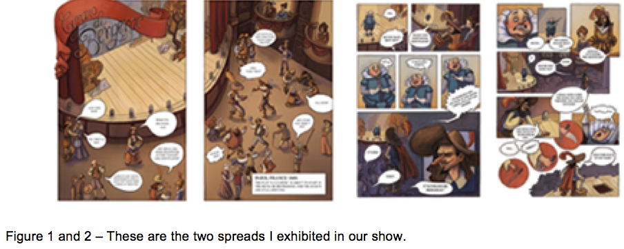
My team organized a “preview” show titled “Restoring the Love of Reading.” It is currently on display in the North Hallway Gallery on the second floor of the BYU Harold B Lee Library. We had agreed at the beginning of the year that each person would show two spreads (two pages that appear next to each other in an open book) and some of our concept work. We decided to do a “floating” show, which means that we spray mounted prints of our work on foam core that was slightly smaller than the prints, to make them look like they’re floating away from the wall. We had an opening reception on Friday, December 7th. We aren’t done with the project, since none of us realized just how much work it is to make a graphic novel for the first time, but we’ve set a goal of having an ebook ready for publishing by April 2013, which we will distribute to local junior high schools.

