John Herzog and Professor Kelly Loosli, Department of Visual Arts
My grant from the BYU Office of Research & Creative Activities afforded me the opportunity to study and research the limited animation style pioneered by UPA in the 1940s and 1950s, and to use my research to design a UPA-style character.
UPA, or United Productions of America, was created due to the Disney animators’ strike in 1941, which resulted in a number of Disney staff members leaving the studio. John Hubley, a layout artist, was one of the people who left Disney, unhappy with the ultra-realistic style of animation that Disney advocated. Hubley and his contemporaries believed that animation should freely experiment with character design, perspective, story and depth to create a stylized artistic vision appropriate for the subject matter. The founders of UPA wanted to create an environment of artistic freedom, where animated films could explore and express ideas considered somewhat radical and uncommercial by other well-known studios in Hollywood (Wikipedia).
Between 1949 and 1951, UPA received fifteen Oscar nominations. UPA won their first Oscar in 1951 for Gerald McBoing-Boing, based on a story by Dr. Seuss (Amidi). Other UPA shorts, such as Rooty Toot Toot and The Tell-Tale Heart, prominently featured remarkable, stylish designs unlike anything offered by the mainstream studios. In fact, the style pioneered by UPA – lovingly referred to as the “UPA style” – eventually influenced significant design changes at major studios like MGM, Warner Bros., and even Disney, helping to usher in a new era of freedom and experimentation in animation (Wikipedia).
Part of the reason this “UPA style” inspires me so much is because of what it says about animation: Anything is possible. While there is room for realism in animation, it is my opinion that believability is the most important aspect of any work of art. The audience must believe in the characters, believe in the situation, and believe in what the artist is trying to convey. So much of our society is about artificiality that we seem to be afraid to explore and experiment due to the very real possibility of failure. The UPA style embraces this notion. The artists at UPA were encouraged to try new things, even if it meant that they failed in the process. I can certainly relate to this in my research and other goals with this project.
To me, the UPA style reflects my love of simplexity, a term coined by the creators of the Disney-Pixar film, Up. To quote production designer Ricky Nierva, “That is the art of simplifying an image down to its essence. But the complexity that you layer on top of it – in texture, design, or detail – is masked by how simple the form is. ‘Simplexity’ is about selective detail” (Hauser). UPA used this idea of simplexity in line, shape, and form – giving us seemingly simple yet complex shapes, stories, and animation. This leads into my experience with the UPA style in trying to design my own character for this project.
Creating a simple character isn’t as easy as it sounds. While watching the old UPA cartoons, it feels like I’m watching Fred Astaire or Gene Kelly dance. They make it look so easy that you convince yourself that anyone can do it. Then you stand up, try to dance like they do, and look rather silly. The same concept applies to creating a simple, UPA-style character. For me, this character is named Bert, and his design took quite a while to get just right.
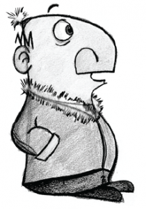
This (below) was the first design for Bert. Initially, I wanted to create a character that had a very prominent, almost Roman helmet for a nose. I also wanted to explore more abstract design for this character; this first pass doesn’t really reflect that. The proportions are more experimental, but the eyes, ears, and all-around form are very conventional. In a nutshell, this wasn’t “UPA” enough for me.
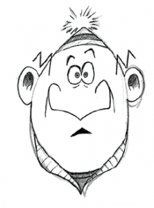
My second pass at the character (below) was more a study of looking at the character directly, trying to figure out how to show the character dimensionally. The design is more simplified and cartoony here; the overall shape is simpler than the first pass. Still too
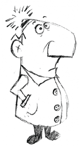
overly complex, but we’re getting there. The third pass at the character (left) became the basis for the final character design for Bert. Here, the design was much simpler than the previous designs. The eyes and ears are significantly less detailed, and the S-curve of the character is more defined. Plus, there’s a little more personality in how the character looks.
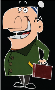
After some tweaking and further simplification, this (below) is the final design for Bert. This perfectly sums up Bert’s character: He’s a cheerful, friendly guy who probably lives in a chilly environment and has a corporate job of some kind. This design represents the UPA simplexity that I’ve been trying to achieve with this character.
This project provided an opportunity for me to realize that simplicity is not an easy thing to achieve. Simplicity requires discipline, and designing Bert really required me to get out of my comfort zone with regard to my design tendencies. Through my research, I am able to say that I have a newfound respect and admiration for those who are able to incorporate simplicity and simplexity in their art, especially those artists who pioneered this style at UPA.


