Lauriann I. Henriksen Wakefield and Professor Robert T. Barrett, Design
Greeting cards are a special way of saying I care about you and what is happening in your life. In addition, the illustration is a primary factor in selecting a particular card to buy. In stores, I studied existing LDS cards and found most are not ascetically pleasing or artistic. To improve this, I developed a line of cards with exciting color and a twist to the usual themes.
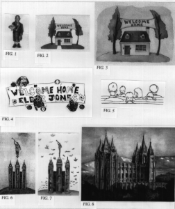
The first area I focused on was the missionary. I remember as a child when one of my brothers would be coming home from his mission, we would create a “welcome home” sign for him. I took this idea and created Figures 2, 3, and 4 for greeting cards. One thing I learned with this project was that my first painting of an idea could be designed and painted better. Fig.3 is the first try with the missionary theme and Fig. 2 is my second try. I took out a background wash, put in a sidewalk, and put more contrast in the colors. Fig. 4 shows young family members painting a sign for their brother. Along with male missionaries, I also wanted to create cards especially for sister missionaries. I painted a 5 year old girl wearing her daddy’s suit jacket pretending to be a missionary, because in her mind all missionaries wear suits. Along with her scriptures, she is carrying her Raggedy Ann doll as her companion (Fig. 1).
Other areas I focused on were temples and weddings. I’ve seen many realistic paintings of the temple, but I wanted to create a more graphic illustration. My first attempt was Figure 6. I wanted to focus on the angel Moroni, but I decided it was too big. So in Figure 7, I made the statue smaller. Fig. 8 is my version of a realistic Salt Lake Temple painting. I chose to paint it with sunset colors to have a more warm feeling in my painting. In addition, while studying bride and groom cards, I noticed they are all mainly traditional bride and groom poses. To focus on a more unique image, I chose to portray the cake cutting ceremony. For the humorous type, I created a card with the bride eating the first cake slice hoping it won’t be smeared in her face.
My favorite idea, because I think it is the most unique, is a greeting card to be given to new families who have moved into the ward (Fig. 5). I find it typical for little kids to stare at the people sitting behind them in church. Using this idea I depicted several young kids peaking over the bench with the caption saying, “We saw you in church today… Welcome to our ward.” Other areas I want to create LDS cards for are family reunions, visiting teaching, home teaching, Christmas, and death.
As an illustrator, I can capture the cultural part of being a Mormon that we all experience such as welcome home signs for missionaries or wearing family reunion “Hello my name is” shirt tags. Through greeting cards I want to depict the average Mormon, similar to how Norman Rockwell depicted the average American.

